
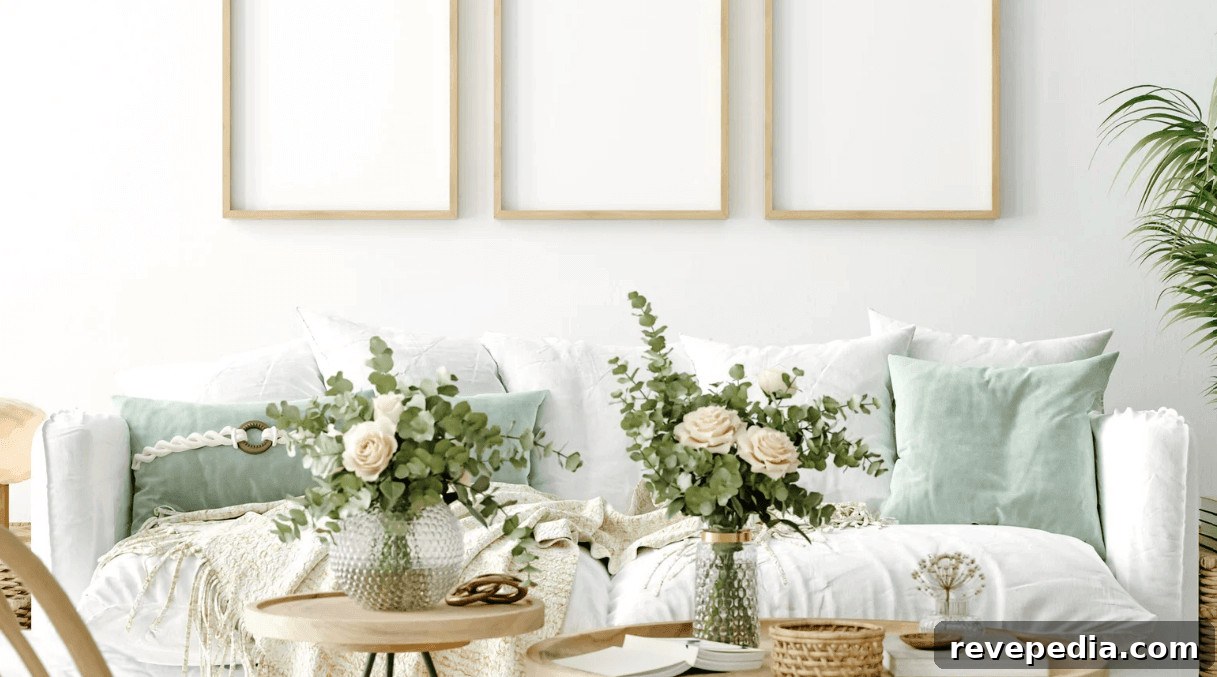
A living room wall filled with personal artwork can read as a deliberately curated collection or as a haphazard clutter of things with nowhere else to go. The difference usually comes down to planning rather than the art itself.
Custom picture framing gives you control over finish, matting, glazing, and overall scale—details that help the artwork and the room feel like a single, cohesive decision. Here’s a practical guide to choosing frame details and placing framed art in a living room so the result feels intentional and timeless.

Matching Frame Finishes to Your Existing Decor
Begin with what’s already in the room. Frames should respond to the materials, colors, and finishes of larger furniture and architectural elements. Warm wood frames pair especially well when they echo existing timber—look to coffee tables, shelving, and flooring for cues.
Dark walnut contrasts nicely with light walls, while oak and lighter woods feel softer and suit minimal interiors that shouldn’t compete with furniture. For modern interiors, metal frames—brass, nickel, or slim aluminum—can pick up on lamp bases, hardware, or other metallic accents. Slim metal frames also work well for prints and contemporary art.
You don’t need a perfect match. Repeating a material or finish in one or two places around the room is often enough to make a frame feel integrated rather than isolated.
Planning Placement Around Your Room’s Architecture
Scale and context matter. A frame that looks substantial in a store can feel tiny on a tall or expansive wall. Because photos and online listings can be misleading, test layouts in the actual room before committing to holes in the wall.
One reliable trick is to cut kraft paper to the size of each intended frame and tape the templates to the wall. Keep them there for a day and view the arrangement from the sofa, doorway, and any adjacent spaces. This makes it easy to spot pieces that feel too small, too high, or visually disconnected from surrounding furniture.
Ceiling height affects composition:
- High ceilings: Vertical arrangements use the extra height effectively.
- Low ceilings: Horizontal groupings help the eye move across the room.
- Any room: Aligning the tops or centers of neighboring frames yields a cleaner, more architectural look.
Don’t feel obliged to fill every blank wall. Leaving generous negative space around a favorite piece often increases its impact.
Choosing Durable Frames and the Right Hanging Hardware
Good frames protect artwork as well as finish it. For larger pieces, choose sturdy moulding that resists bowing, tight corner joints, and a solid backing. If you want to preserve photographs, prints, or other paper-based works, insist on acid-free matting and backing materials.
Ready-made budget frames can be fine for temporary displays or posters, but custom framing often provides stronger moulding and archival-quality backing that preserve value over time.
Hanging hardware should match the weight and wall material. As a general guideline:
- Light frames (under 10 lb): A standard picture hook or lightweight hanging system will usually suffice.
- Medium frames (10–30 lb): Use D-rings, rated picture wire, and appropriately rated wall hooks.
- Heavy frames (30 lb and up): Anchor into studs where possible, use heavy-duty anchors, or install a French cleat for secure support.
These ranges are guidelines—always verify hanger and anchor ratings and choose fixings suited to drywall, brick, or plaster walls.
How to Lay Out a Balanced Gallery Wall
A gallery wall doesn’t require matching frames to feel cohesive. What matters is visual consistency—balanced spacing, repeated tones, and a rhythm of sizes that reads as an intentional composition.
Useful starting points:
- Leave approximately 2 to 3 inches between the edges of adjacent frames.
- Position the center of the entire arrangement around 57 to 60 inches from the floor as a baseline, then adjust based on furniture and room proportions.
- Distribute similar colors, frame weights, or visual densities across the layout instead of clustering everything heavy on one side.
First arrange frames on the floor until the composition feels balanced. Then trace each frame onto paper, tape the templates to the wall, and mark your hanging points through the paper. That extra preparation saves time and prevents a line of unnecessary holes.
Choosing Mat Colors That Complement Your Artwork
Matting creates breathing room between the image and the frame and can help separate artwork from the wall color. White and off-white are classic choices—particularly effective for photography and multicolored prints—because they are neutral and unobtrusive.
Darker mats such as charcoal or navy create drama around bright or lighter works, but remember a dark mat increases visual weight and can dominate a grouping. For a subtle accent, consider a double mat with a thin colored inner layer beneath a neutral outer mat; that narrow colored edge can pick up a hue from the artwork without overwhelming it.
How High Should You Hang Art Above a Sofa?
The sofa provides both a width and height reference. Aim for artwork or a grouping that spans roughly two-thirds of the sofa’s width so it reads as a single visual unit. A small piece above a wide sectional will often feel lost, whereas a cluster of smaller frames can achieve the same presence.
For vertical placement, leave about 6 to 8 inches between the sofa back and the bottom of the artwork as a starting point. Adjust this based on sofa height, ceiling height, and the scale of the art. The goal is for the sofa and art to look deliberately related rather than two unrelated elements sharing the same wall.
Mixing Modern and Traditional Frame Styles
Contrasting frame styles can add interest when they share at least one unifying detail. A vintage gilded frame around a modern print becomes a focal point; a slim metal frame can make a traditional piece feel more contemporary.
Ways to create harmony:
- Pair ornate frames with clean white mats to temper their formality.
- Place slim metal frames next to carved wooden ones to create tactile contrast.
- Repeat the same mat color across different frames to create cohesion.
- Carry a single metal or wood tone into other elements of the room to tie the composition together.
Lighting Your Framed Art
Natural light changes throughout the day, so consider how framed art looks both in daylight and after dark. Picture lights mounted above larger works highlight texture and detail; LEDs are a practical choice since they emit little heat and minimal UV. For a larger gallery, adjustable ceiling spotlights can provide even illumination across multiple pieces.
Manage glare with anti-reflective glazing, and consider conservation-grade glazing for prints and photographs you want to protect. Avoid placing light-sensitive works where they will receive prolonged direct sunlight, even with protective glazing.
Seasonal Swaps and Frame Maintenance
Rotating prints or photos by season is an easy way to refresh a room without repainting or replacing furniture. If you expect to change artwork frequently, ask your framer for easy-open backing systems such as turn buttons or flexible points to simplify swaps.
Maintain frames by dusting with a soft microfiber cloth. When cleaning glazing, spray cleaner onto the cloth rather than directly onto the frame to avoid moisture reaching the edges. Periodically inspect wires, hooks, and anchors—especially for pieces hung above seating—and tighten or replace hardware if it shows signs of wear.
Bringing It All Together
Framing a living room wall doesn’t require a uniform set of matching pieces. Some of the best displays grow organically over time from family photos, prints, and collected artwork. What makes a wall feel polished is consistency in proportion, finishes that echo the room, and spacing that allows each piece to breathe.
Measure before you hang, test your layout with paper templates, and use hardware suited to the frame weight and wall type. Once those practical concerns are addressed, you’ll have the freedom to create a personalized, visually pleasing display that makes the living room feel finished and lived-in.